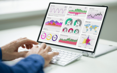


The explosion of data in the enterprise is a real opportunity to reinvent the way we work. Their analysis facilitates decision-making through the use of dashboards and reports. Data visualization tools are becoming increasingly powerful, helping us to analyze this data. But before making your choice, it’s a good idea to find out about the advantages and disadvantages of each of these solutions. We present the must-haves:

Microsoft Power BI is highly recommended for data analytics. It’s an intuitive platform with good ergonomics. It lets you design parameterized dashboards and interactive graphics in a style that facilitates communication. Power BI can connect to a wide range ofdata sets , synthesizing the information provided so that it can be better assimilated and understood. You’ll be able to work in a team on data science projects and perform queries in a simple language with graphically impeccable rendering. Power BI is becoming increasingly popular thanks to its integration with the Microsoft suite.
Power BI highlights
- Power BI can handle large volumes of data.
- Machine learning functions help analyze data and guide users in spotting trends.
- As Power BI is cloud-based, functions and algorithms are regularly updated.
- It features powerful customization capabilities, enabling users to create dashboards to quickly access the information they need.
- Alerts can be set on key performance indicators (KPIs).
- Power BI’s intuitive interface makes it easy to use.
- The platform integrates with other popular business management tools such as SharePoint, Office 365 as well as other non-Microsoft products such as Salesforce, Hadoop and Google Analytics.
- Power BI guarantees data security by offering granular accessibility controls.
Rates
From €8.40 for the Pro version and €16.80 for the premium version

If there’s one timeless classic when it comes to data visualization, it’s Tableau. It guarantees excellent data exploration and provides all the Business Intelligence (BI) functionalities you’ll need for your business. It is also renowned for its flexibility and ability to generate exceptional graphic representations. With its intuitive interface, Tableau makes it easy to manipulate banks and datasets.
Highlights of Tableau Software
- Tableau’s data visualization quality and processing speed are superior to those offered by the competition;
- No programming knowledge is required to use Tableau. You’ll be able to create eye-catching graphs from your data using the drag-and-drop function;
- Tableau can connect to hundreds of data sources such as Google Analytics & Google Sheets, PDF files and Dropbox, without the need for programming;
- Tableau is designed so that you can share sensitive information and collaborate securely;
- Tableau lets you design, customize and publish dashboards for desktops, phones and tablets.
Rates
From $35 / month / user (€30) for the Explorer version and $70 (€60) / month / user for the Creator version
A Viewer version at $12/month/user is also available.
Equally popular, Infogram is the data visualization solution for data analysts in marketing and finance. This program is ideal for computer graphics and slide presentations. It features a drag-and-drop option to make work easier. It can also be used to create graphics, sophisticated maps and reports.
Infogram strengths
- It features a library of ready-to-use templates to help you launch your visualizations with polished graphic design.
- Infogram lets you create interactive, data-driven experiences that engage your audience without having to write any code. Its drag-and-drop editor and easy data integrations simplify the data visualization process.
- Interactive content, including animations, graphics and maps, will enhance your communication.
- The platform enables teams to collaborate in real time, creating a centralized library where users can work together to create, modify and publish projects.
- The platform provides metrics and information on how viewers interact with the graphics. This will help you measure the effectiveness of your communications.
Rates
From $19 / month / user (€16) for the Pro version and $67 (€57) / month / user for the Business version
A free version is also available to get you started with the tool.

QlikSense is adapted to the management and analysis of massive or Big data. It is widely used by major financial institutions. With QlickSens, you can synthesize your raw data into statistics toidentify trends in your business. Thisdata analysis and visualization tool will help you make strategic decisions.
QlikSense highlights
- QilkSense is packed with features that allow users to ask questions and get visual answers.
- Drag-and-drop functionality lets you easily create dashboards and reports without the need for scripts, complex queries or joins.
- QlikSense acts as a central location for developing and sharing applications, data analysis and information quickly and efficiently.
- You can unify disparate data sources on a single platform. What’s more, when you manipulate views and dimensions, irrelevant data is “grayed out” instead of being ignored. This allows you to discover hidden trends.
- QlikSense lets you create simple visualizations that respond instantly to changes in data dimensions and context.
- QlikSense adapts to all your devices, whether desktop, tablet or smartphone.
Rates
From $30 / month / user (€25) for the Business version
Looker features an extensive library of data representation models. As the forerunner of a new wave of data visualization tools, you don’t need to learn or train to use it. This software is designed with innovative data mining features for all sizes of business. However, it is possible to design your own analytical modules using SQL.
Looker highlights
- Looker is extremely easy to use. You don’t need to be an experienced data analyst or have SQL knowledge to manage workflows using this tool. The platform also includes self-service functions such as filtering, pivoting and the creation of visualizations and dashboards.
- Looker enables and streamlines collaboration between users. The application can be accessed from any browser and on all your mobile devices. This facilitates collaboration and remote working.
- You can explore the data using the self-service function, then refine the automatically generated visualizations. It makes it easy to create customized dashboards to reflect your company’s key performance indicators;
- It creates live connections with over 35 SQL databases via a virtual query schema. Data visualizations are secure and updated in real time.
- It can be deployed in third-party solutions such as CRM or ERP as an integrated iframe or via Javascript.
Rates
Prices available on quotation only
Zoho Analytics is a drag-and-drop data analysis and visualization tool specially designed for users who want to visualize business and financial information. It’s a self-service tool for visualizing sales, marketing, profit, revenue and cost information through cross-functional dashboards. It lets you manipulate and report on large quantities of raw data. Zoho is equipped with artificial intelligence (AI). This allows you to formulate queries whose results will be rendered in the form of reports.
Zoho Analytics highlights
- Zoho Analytics offers a vast library of visualization types and lets you create dashboards. It also lets you merge multiple reports into a single dashboard to better understand key data trends.
- It also offers geographic visualizations to facilitate comparisons between regions.
- Zoho Analytics integrates with other solutions: CRM, ERP and others.
- The platform’s scalable and extensible architecture means that analyses can be created and integrated into applications of any size.
- You can develop a 360-degree view of your organization by mixing different types and sources of data, including external sources, in a single database.
Rates
From €24 / month / user for the Basic version and €48 / month / user for the Standard version
Dundas BI is a data visualization and business intelligence platform for large enterprises. It’s an easy-to-use tool that lets any user create interactive data visualizations and attractive dashboards. Dundas BI can be integrated into your existing applications. This is an asset for companies wishing to enhance their existing tools with improved data visualization and analysis capabilities. Fully scalable, Dundas BI centralizes all your company’s data, enabling you to produce interactive reports and dashboards to guide strategic decision-making.
Dundas BI highlights
- It enables you to collect data from different data sources and generate intuitive data visualizations. This enables you to analyze data, identify patterns and forecast trends in your business.
- Dundas BI helps you create reports tailored to your needs by exploiting built-in formulas or using drag-and-drop functionality.
- With Dundas BI, you can recover lost work. Quickly restore recently or accidentally deleted dashboards, reports, folders and files from the recycle garbage can with automatic backup.
- It improves employee productivity and ensures data security by designing, programming and distributing professional e-mails from templates on the platform.
- You can access and publish your data from any browser.
Rates
Prices available on quotation only
Conclusion
The choice of one or other of these tools depends largely on the objective being pursued. Your choice should take into account versatility, deployment costs, data processing capacity, adaptability and the type of package offered by the different publishers. If you’re still working in Excel, it’s time to step up a gear with a data visualization solution.
👆 If you’re looking for support with a data visualization project, call on the Altermès teams to help you!
🔎 Find out more about ourtechnological innovation offers!